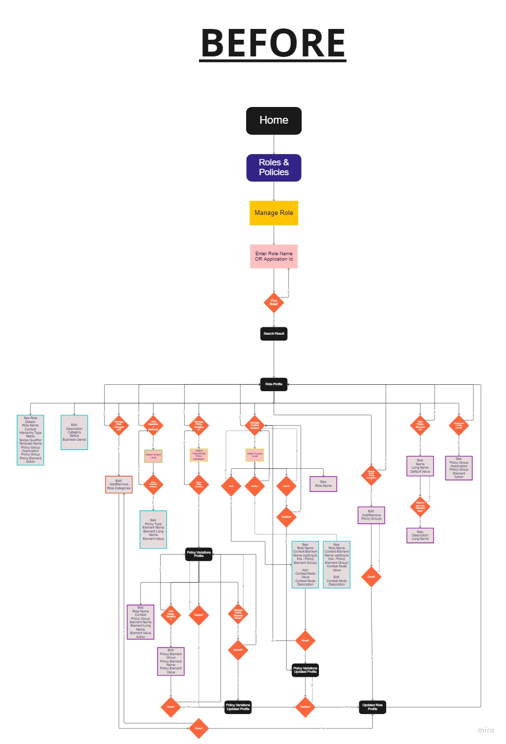
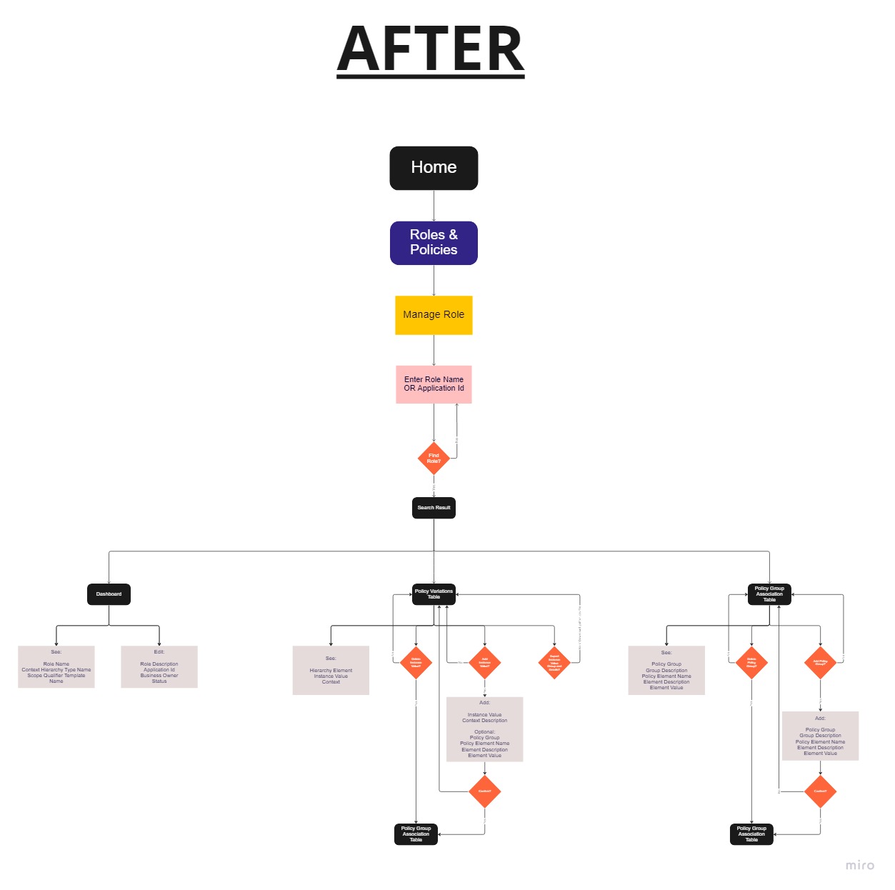
Main Responsibilities:

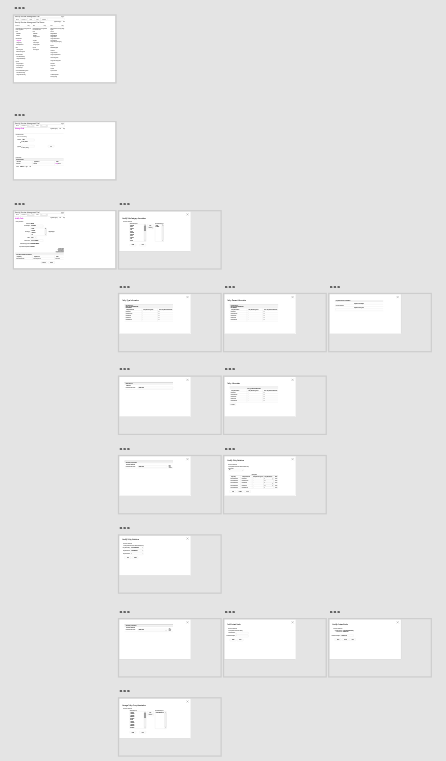
Conducted user researches, analyzed and used the results to set up best potential solutions for the MVP. Demonstrated the wireframes, prototypes to the whole scrum team and stakeholders, examined feedbacks, and continued improving the solutions. Simplified the system, added new features, upgraded client design system, normalized data. Created project wireframes and prototypes in Figma. Planned and tracked project via Jira agile project management tool.

The Ask:

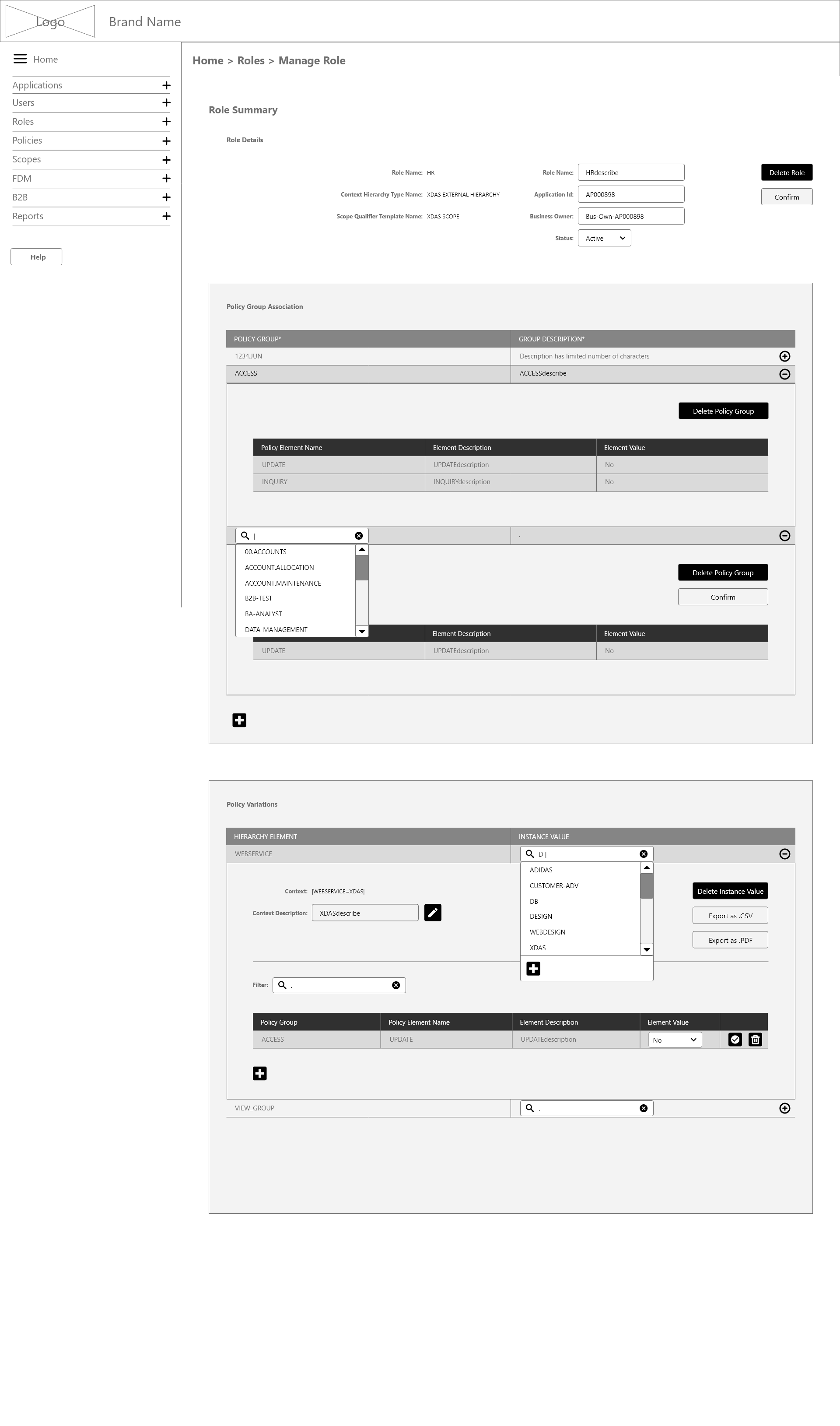
  • The permissions and access of users must be monitored and managed in a succinct manner.
  • Creation and design of individual flows for existing and new features to simplify complex management process.
  • Improve the design system to give it a modern aesthetic and make it responsive.
  • Differentiate and categorize all possible actions to elucidate the workflow for each user role.

What Got Done:

  • The appropriate navigation directs users straight to the place where specific actions need to be done.
  • Combined related process subtasks into one flow instead of working through them individually over multiple pages.
  • Added a functional filter to locate info quickly, addressing the tedium of manually scrolling through thousands of data points.
  • Provided an option to import/export files with all relevant info to minimize time lost from copy-pasting data.
  • Built an intuitive platform to access all employees' profiles, account types, access permissions, and more.
  • Removed dozens of pop-up windows and incorporated each of their functionalities in a simpler, intuitive flow.

The whole process started by getting an idea of what the whole page was meant for. I did heuristic evaluation. I measured the usability of user interfaces in independent walkthroughs and reported issues. I had contact with some employees who are the system daily users, and got some great feedback from them - about confusions, management, inconsistencies, errors, and much more. Below there are two user flow diagrams that display the difference between one out of eight independent walkthroughs before and after analysis and restructuring.

The Main Pain Points

One great pain point was the amount of modals/popup windows. For example, when adding a user, the common tasks are to give the user personal info, its work permissions, work role, work start/end dates etc. Initially, these fill-up subtask categories had their own individual flow on a modal, some modals opened another modal, so the user ended up having multiple windows open just to give data about one certain user. I changed the system structure into a way where all info was possible to insert on one page at one time.

Below are the wireframes of the pages before and after simplifying the Manage Role section. Thirteen modals were transformed into one full page with all functionalities remained.


The navigation was lacking its purpose. Initially to get into any flow, the user had to go to Home page to select that path. I added an organized navigation bar with breadcrumbs included.

The client has its design system, but it was also in process of improving towards modern aesthetics. For useful functionalities, I created there some new assets, for example filtered search field to locate info quickly and avoid continuous scrolling through thousands of data points. (example 2: import/export files functionalities instead of copy-paste tables)

The error and warning banners were not specific enough. For every banner, the user got alerted about the reason of error, the potential solution, and a link to land on another related page.

Bonus

During one of my work demonstration, the product owner got onto a conversation with the leaders referring to another additional function that might be a good transformation to have for employees working within another department. It was neither my task, nor part of this project at all. However, since I understood the topic and I happened to have a good idea in mind, I put together a prototype of its potential solution and offered that to the leads.

Purpose: Importing and registering/editing/deleting a bulk of users at once, instead of individually.

  • I made a certain template that all responsible employees would need to use
  • Since there was more tasks available, the users needed light instructions added to pages where further steps needed to be taken to complete the process.

Once representing the thoughts, the product owner and manager were impressed with the solution. That prototype was made as part of the project and got forwarded for the development team to set up and publish.